
“We don’t just build websites, we build websites that SELLS”
―Christopher Dayagdag
Website Design is the showcase of your business profile. 82% conversation rate gets secured by the design of the website.
If your website looks nonsense, the rate of conversation hits the south despite an extra-ordinary product catalogue.
Not only for the biggies, a sound website design for small business owners carries the same weight. Don’t confuse it with the preface of your business portfolio. It’s just another important marketing tool for the business owners.
Every year a whole lot of new design styles and techniques are brought into the picture. But it’s only the user-centric designs that drive sales. So, modern website design is just an analogous phrase.
If you think website design is just a ‘pretty face’ you are probably lacking on the basic skills!!!
A lot depends on your website design such as- SEO, Social Media Marketing, creating lead ads for business conversion and many more. Therefore, a infinitesimal overlook can harp the conversion rate on a major scale.
A recent research of Stanford University suggests 46.1% of people say a website’s design is the top criteria for deciding if a company is credible or not.
A business website must look professional. Website design in Kolkata mostly on this basic criterion. A pleasant looking website has a huge role in business conversation rate.
Let’s check out the most effective design principles that one needs to follow while he/she gets into the web design for small business owners. If you still face a hitch here are its web design solutions that will save you from misery.
Take tour:
Have you heard of the term called ‘Visual Hierarchy’?
Let’s begin from the basics then.
1. Visual Hierarchy: The more extrusive visual, the higher diligence. This one basic idea can transform your design right from the beginning.
Before you start anything, you must know how the human eyes perceive what they see.

Now if we ask you to rank these circles in order of importance, anyone can do it without any fail. This is called as “Visual Hierarchy”.
The significance of highlighting this part is there are certain parts of your website (call-to-action, forms, value proposition) that you need to place as per the perception of human eyes.
It’s basically the portions in which you want your potential visitor would click more. Make important links more easily seen. Preferably use different colour to highlight important sections.
It’s pretty simple actually. Rank the elements as per your business objectives. Small business owners have a limited business goal set.
So before starting website design for small business, a design unit must know their client’s business goals in order to prioritize the element placement.
Make sure that the visual hierarchy is well in place.
2. Segregate the proportions:
Golden-ratio is a number that looks after the proportion. 1.618 – This number denotes all things are proportionate and the visual gets perceived appropriately.
Take a look at the Golden-ratio.
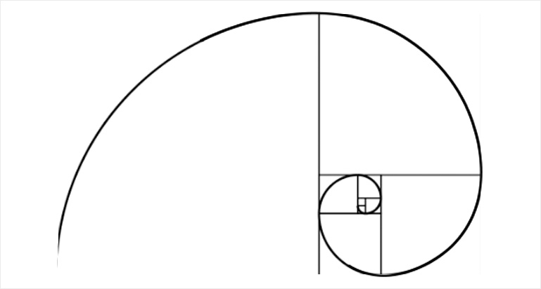
Turning over the golden chapters of history, we can discover that most of the famous architectural masterpieces have been crafted based on this proportion.
Now, you are probably thinking that whether the same would help in web designing?
Why not?
When your layout width is 960px, divide it by 1.618 (=593px). Here you get the content area, which would be 593px and sidebar 367px. Assume, the website height is 760px, you can break it into 470px and 290px blocks. (760/1.618=~470).
3. Time to follow the Hick’s Law:
Hick’s Law is one of the most popular theory for the web designers. It is the guideline for the menu design proportions.
It says: “With every additional choice increases the time required to take a decision“
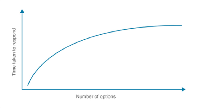
Let’s break down the theory in a simpler way. Suppose you visit to a garment shop. The more variety you get the much confused you become. Right?
Same goes with the Menu bar of the website. The more addition you include, the faster it’s to end up selecting nothing. Keep the choices lesser.
Keep your Menu simple and sorted. Eliminate all the inadequate options from this segment throughout the design process. Provide the visitors a delightful user experience.
Again, if you don’t have a vast product-line up, people might think that you have a narrow product-line. Add more filters for convenient decision making.
This is why you should always go for the best team of Website Design in Kolkata. Else, you might join with the most performed goof-up.
Wait, this rule doesn’t end here.
While visiting a website visitors have multiple queries in their mind and also a series of decisions to make.
A designer has to make a chain of important decisions while designing a website.
Here are just a few attached rules to follow with the Hick’s law:
- Choose between whether to use the navigation bar or scroll down the page.
- Brush up the headlines to highlight the blog post readability.
- Determining whether to download the lead magnet, share social media posts, and leaving a comment.
- Selecting between buying, going through product review and exploring more product line-up.
The simple method to incorporate Hick’s Law is to install a full-screen welcome gate on your homepage. A welcome gate caps the complete screen with a single call-to-action button. This way, the visitor only sees the available choices to make and then they will scroll down.
4. Fitt’s Law for web design:
Fitt’s Law is all about clicking the button on a webpage.
That’s it!!
This law pins down the time required for locating the targeting area. It signifies the function of the size of the target area and the distance to the target.
The bigger size object the better chance to click. It’s sensible to place it on the left bottom of the corner. Because, the corners have 60% accessibility than the rest of homepage.
According to Neil Patel, “64% conversion increase by helping visitors make easier decisions.”
However, it never means the bigger button the better conversion generation. Certainly you won’t make a button which occupies half of the screen space.
Fitt’s law throws light on this part in particular. Again it’s a two-folded wanton. The usability of an object goes with a curve, not by the straight line.
With a 20% increase in size, a small button can score 20% higher clicks. While a bigger object turns off the usability when increased in the same measurement.
Based on the frequency of use, one should proportionate the button size. Following this rule, a designer should size up the buttons.
5. Rule of Thirds:
This is another major rule for designing a buyer-driven website.
Tell us what attracts you the most in a website? Obviously images. Right?
Now today’s trend is more or less on the minimalistic side. However, more than stock photography, custom-made images engross wider audience.
For this one good reason you should visit an expert team which has the up-to-the-market skills of website design in Kolkata.
The image section of any website follows the rule of Thirds which says, “An image should be imagined as divided into nine equal parts by two equally spaced horizontal lines and two equally-spaced vertical lines, and those important compositional elements should be placed along these lines or their intersections.”
The equal nine squares are to be placed as follows:
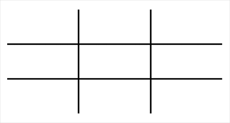
The objects are supposed to be placed on the intersectional points of those two lines.
Following this one rule can make your image selection and placement more catchy and more impactful.
6. Negative space and clear design
Widely known as ‘White Space’ – this is the space which is broadly left empty. This space belongs to the graphics, space between the columns/lines/types/texts, margin, visuals.
Technically this space is not for leaving empty. Thus, this space is also an important part in designing a website. It highlights the objects in it. This space is all about using the echelons of varied info such as type/images/colours.
A page should never be choked with full of images and graphics. It would rather appear noisy and full of distraction. Your visitor would lose interest to read the context.
Top designed websites perform 2X better, because they are simplistic.
The more whitespace, the cleaner design appearance. A clean design communicates with the audience much easily.
Clean design symbolizes the design which cleverly uses the place in between. A sensible designer should know how to use this white space for securing a smarter communication.
The core message of the website should be distinct and uninterrupted.
Don’t forget to K.I.S.S – Keep it Simple, Stupid.
7. Speed optimization
A slow loading website is seriously can spoil the entire broth.
If your website has a slower loading time; then whatever attractive products and services you offer, it will all go in vein.
This is the biggest turn-off from the visitors’ standpoint.
Today people ask for services that are immediately at their fingertips. Thus, a competent designer should never overlook the website speed optimization part.
Especially when you are into the business website design for small business owners, you should always remember that a big chunk of sales depends on the speed optimization of the website.
A newbie definitely won’t want his potential visitors go off due to a slower page loading time.
Here are few tips to optimize your website loading time:
- Optimize the images. Never mind their size.
- Enable compression. Files will look more compact and open faster.
- Reduce HTTP requests in Google chrome developer tools.
- Select the right hosting options whether its shared hosting, VPS hosting, or a dedicated server.
Integrate these tips while designing a fast-performing modern-day website. Give more focus to user experience and the functionality of the website.
“In the information age, build a website before you build a workplace.” – Amit Kalantri
8. Clean backend coding
A modern business should have to a fast-performing and rides on the ‘functionality’.
To make a website run successfully a whale of backend coding is necessary. It’s only the functions of the website that can convert visitors into leads and buyers.
Every design unit should have a well-skilled set of developers who exactly know how to code a site to function perfectly, load fast, and navigate flawlessly.
A clean and crisp backend coding will give you access to read, edit and maintain website functions. Also if any major/minor problems arise, it can be easily found and fixed with the prior backend code.
However, an efficient website design and a piece of art is not the same.
A website design must have a clean business objective. Maintaining these aforesaid rules can easily get you best results in both aesthetically and financially.
Share with us your suggestions in the below comment section.
Your suggestions are valuable.
Associate with us for top-performing website design and development.


You can connect with Mohammad Mohsin on LinkedIn


