-
Psychology of Colors in Web Design and How it Affects Conversion
- 90 percent of all product assessments are influenced by colors – QuickSprout
- 85 percent of the reason why you buy a specific product is the color – Neil Patel
Since colors often decide behavioural responses in human beings, it affects the conversion rates of your website. This is what makes color a crucial aspect when it comes to designing your website and gradually proceed for online marketing.
What is Color Psychology?
Color psychology is the science about how colors affect human behaviour. Knowledge of color psychology is a must for store owners, product designers, website designers, and everyone else who wishes to increase the conversion rate on the website. In terms of online marketing, color psychology allows you to understand how your customers would respond to your messages based on the color you use for the copy, CTA (call-to-actions) and links.
For example, most food websites use a combination of yellow and red, since this color combination is known to intensify hunger! So chances are the sales for your food website will improve if you use this color combo in your website because the combination of yellow and red color converts the best for the food website. http://www.hongkiat.com/blog/designing-restaurant-websites
According to NeuroMarketing, “if a good colour sells, the right colour sells better.”
Tips to Improve Conversion Based on Color Psychology
01. Avoid Grey, Orange, and Brown for Women-Centric Websites
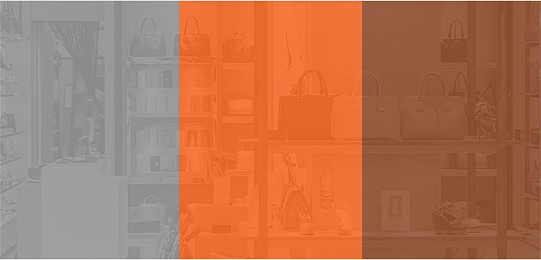
A survey revealed that blue was the favorite color for 35 percent of women, followed by purple (23 percent) and green (14 percent). Whereas they disliked orange (33 percent), brown (33 percent) and grey 17 (percent).
So if you are designing a website that is targeted to female audience avoid using colors that they dislike. Though the normal notion is to use pink for women, but using colors like blue, green an orange can also improve the conversions rate considerably.
-
02. Use Blue, Green and Black to Attract Male Audience
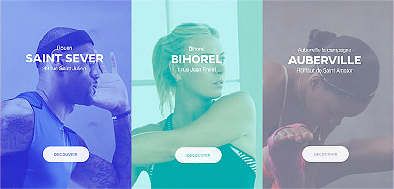
If you are designing a website that is solely targeted towards men, try using blue green or black in a right way which are known to highlight maleness. By all means avoid using purple, orange or brown if you are focused on website conversions.
-
03.Use Blue for Gaining Trust
Blue infuses a feeling of trust, calmness and serenity that attracts people towards it. So to win loyal customers, you can widely use this colour on your website and on the landing pages. Facebook, the most renowned social media site also uses blue to spread the core message- transparency and trust. Blue is also used by leading banks, payment gateways, and more where instilling a sense of trustworthiness and reliability is important.
Avoid using blue for food websites, since this color is associated with Poison!
-
04. Selling Environment-Friendly Products? Use Green!
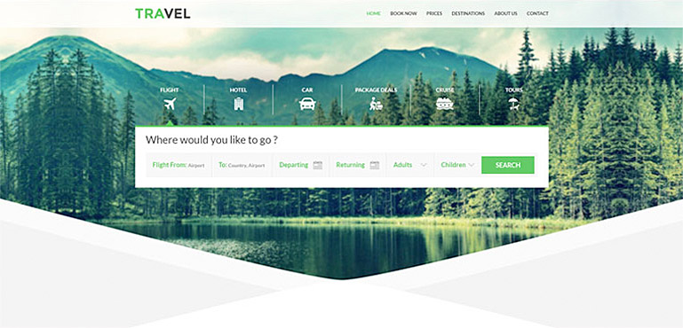
Green signifies environment and Eco-friendliness and it also improves creativity. If your business deals with outdoor products or anything that is natural or Eco-friendly, green will be the best-suited color. Green also works well for call-to-actions and that definitely helps is marketing.
-
05. Color Psychology Of Black – Adds a Sense of Luxury
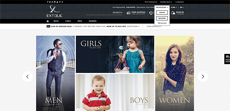
If your website depicts luxury, boldness or sophisticated, then the only color you should go for is Black! High-end eCommerce website and luxury designers use darker tones to make people feel classy.
“Black can also be seen as a luxurious color. ‘Black, when used correctly can communicate glamour, sophistication, exclusivity.’” – Business Insider
-
06. Use Bright Colours for Call-to-Action Buttons
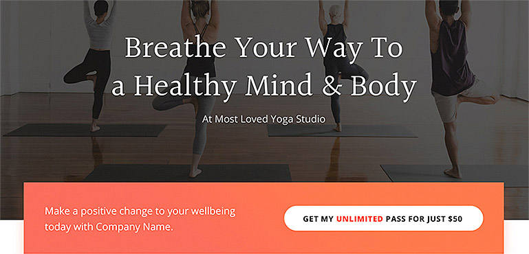
Call-to-actions are what trigger the conversions or your website, so make use these are visible and appealing to human eyes. For CTAs try using bright primary and secondary colors such green, red, yellow and orange. The brighter the color better will be the conversion rate.
Colors can help you attract the right audience at the right time. So make sure you choose the right color psychology when designing your website to improve its conversion rates in online marketing.
How to Use Color Psychology For Web Design
