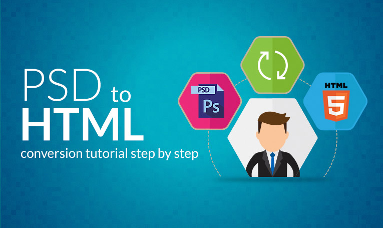
In this article, we will show you step by step to carry out PSD to HTML conversion so that you get can 100% pixel perfect design, compatible with any browser.
Before you start with the PSD to HTML conversion process, you need a text editor and Photoshop to measure the sizes, distance, and colors.
Given below are the steps for PSD to HTML conversion:
1. You need to create a directory folder that should have two folders for images and CSS such as /images directory for images and /js directory for JavaScript. You can keep the CSS file in the root folder including the HTML file. Put the doctype and meta tags in your index file defined.
<!DOCTYPE html PUBLIC "-//W3C//DTD XHTML 1.0 Strict//EN">

<html xmlns="http://www.w3.org/1999/xhtml">

<head>

<title>Converting PSD to HTML</title>

<meta http-equiv="Content-Type" content="text/html; charset=utf-8">

<meta name="keywords" content="demo keyword">

<meta name="description" content="demo decsription">

</head>

<body>

</body>

</html>
2.You need to decide how to implement the template, start by making 3 basics for header, contents, and footer. After you have defined the divs, the body tag of index tag will look as shown below.
 <body>

 <div class="header"> </div>

 <div class="content"> </div>

 <div class="footer"> </div>

 </body>
3. Make the contents of the template of a fixed width but keep in mind the background should extend to the full width of the screen. You can put the div inside another div that will occupy the full screen, called wrapper. The modified code is shown below.
<div class="content"> <div class="wrapper"></div> </div>
If you want to color every pixel of the screen, you need to use the full screen as a body. If you want to put contents in middle, you need to put margin to auto. Add these to your main.css file.
<div class="content"> <div class="wrapper"><p>test-paragraph</p></div> </div>

.content{

overflow:hidden;

background-color: gray;

}

.wrapper{

width:1170px;

margin:0 auto

}
4. You can insert the logo of the company. You have to take a div then anchor tag and insert the logo image. Always mention the name of the company as an alt tag. You can position the img to the leftmost point by setting the float attribute to left. Make these changes in the index file.
<div class="header"> <a href=”company url”><img src="images/logo.png" alt="company name" title=” company name”></a> </div>
Set the CSS of logo img in a main.css file, crop or extract the logo from PSD and save it in the images folder. You need to write the code given below in your CSS file to place the logo at the right position.
.logo{

float:left;

}
5. You should know the most important part of the header is set of links and you need to place it in list tag. Place all the links in a separate div and as unordered list, navigation. You need to put the HTML part inside the header div.
<div class="navigation">

 <ul class=”nav”>

 <li><a href="#">Home</a></li>

 <li><a href="#">Product</a></li>

 <li><a href="#">Services</a></li>

 <li><a href="#">News</a></li>

 <li><a href="#">Contacts</a></li>

 </ul>

</div>
If the links do not show in the way you expect and placed one after another then you need to do by CSS.
If you want to place the entire div at a correct position on the screen, you need to change the CSS of navigation div to fix it. You can decorate the links by changing the CSS of li tag.
.nav ul{

 margin:0;

 padding:0;

 overflow:hidden;

}

 . nav ul li{

 float:left;

 font-size:14px;

 line-height:18px;

 border-right:1px solid #fff;

 margin:0 10px 0 0;

 padding: 0 10px 0 0;

}

 . nav ul li:last-child{

 border-right:none;

 margin:0;

padding:0;

}

. nav ul li a{

display:block;

color: #000;

}

. nav ul li a:hover{

color: #F00;

}
You can update your navigation section, add a class or remove class using javascript when a user clicks a link.
6. In the contents div, you need to first implement the welcome part. You can put it in a div called intro1 that will fix the position of the contents. Next, put the contents of the div in sub div called a welcome. Insert the code given below in your contents div.
<div class="welcome">

<h3>Heading</h3>

<p>Paragraph</p>

</div>
You need to define the h3 and p style for the welcome div which is done by nesting.
.welcome{

 overflow:hidden;

 background-color:#fff;

}

 .welcome h3{

color: #000;

font-size:28px;

line-height:34px;

font-family: 'Montserrat';

}

.welcome p{

font-family: 'Montserrat';

font-size:18px;

line-height:25px;

color:#e2e2e2;
}
7. You need to consider the right part of the contents div that contains a slideshow. Replace it with a static image for now. Make a div portfolio and fix its height using CSS and set its background image to the image shown below.
<div class=”banner”></div>
CSS to fix the container configuration.
.banner{

background:url(../images/banner-image.jpg) no-repeat center 0;

height:500px;

background-size: cover;

}
Set the background-repeat to none if you want the image to appear only once.
8. To design 3 boxes each having some text, you need to take one unordered list with 3 <li>tag.
<ul class=”pods”>

 <li><p>some text</p></li>

 <li><p>some text</p></li>

 <li><p>some text</p></li>

 </ul>
Take the ul in a parent div.
 <div class="container">

 <ul class=”pods”>

 <li><p>some text</p></li>

 <li><p>some text</p></li>

 <li><p>some text</p></li>

 </ul>

 </div>
.container{
overflow: hidden;
}
.container ul.pods{
text-align:center;
margin:0;
padding:0;
overflow:hidden;
}
.container ul.pods li{
display: inline-block;
width:300px;
background: skyblue;
vertical-align: top;
margin:0 30px 0 0;
}
.container ul.pods li:last-child{
margin: 0;
}
.container ul li p{
font-size:18px;
line-height:25px;
color:#fff;
font-family: 'Montserrat'; }
9. To design 3 boxes each having images, you need to take one unordered list with 3 <li> tags. Insert one image in each li tag.
<div class="container">

 <ul class=”image-pods”>

 <li><img src=”images/demo-image-1.png”></li>

 <li><img src=”images/demo-image-2.png”></li>

 <li><img src=”images/demo-image-3.png”></li>

 </ul>

</div>
.container{
overflow: hidden;
}
.container ul. image-pods{
text-align:center;
margin:0;
padding:0;
overflow:hidden;
}
.container ul. image-pods li{
display: inline-block;
width:300px;
background: skyblue;
vertical-align: top;
margin:0 30px 0 0;
}
.container ul. image-pods li:last-child{
margin: 0;
}
.container ul. image-pods li img{
width:100%;}
You need to assign the design of classes simultaneously. You can use the image in the download folder initially or crop the images.
10. You need to put the heading and tagline for all of the boxes. Place the heading in h4 tag and tagline in different div with a specific class.
<div class="container">

 <ul class=”image-pods”>

 <li>

 <img src=”images/demo-image-1.png”>

 <h4>heading 4</h4>

 <p>paragraph</p>

</li>

<li>

<img src=”images/demo-image-2.png”>

<h4>heading 4</h4>

<p>paragraph</p>

</li>

<li>

<img src=”images/demo-image-3.png”>

<h4>heading 4</h4>

<p>paragraph</p>

</li>

</ul>

</div>
You need to set the style of the classes and h4.
.container ul. image-pods h4{

 font-size: 20px;

 line-height:25px;

 color:#000;

 font-family: 'Montserrat';

}
11. You need to define a div which has a border at its end, fix its min height to the thickness of the line. Next, define a div with class text that will help you to put contents in the boxes with indentation.
<li>

 <span class="separetor">

 <h4>heading</h4>

 </span>

 <p>tagline</p>

</li>
Now, define the style properties for the separator and the text class. The separator class and text contain a border line and entire information shown in the boxes. You should set the text-align to justify.
.separetor{

 border-bottom:2px solid #000;

 display:block;

 margin: 0 0 10px 0;

 padding:0 0 10px 0;

}
12. Put the read more button to the right end of each of the boxes.
<li >

 <span class="separetor">

 <h4>heading</h4>

 </span>

 <p>tagline</p>

 <a href="google.com" class="btn"><span>Read More</span></a>

 </li>
Style for the button defined as:
. btn{

 font-size: 16px;

 line-height: 39px;

 border: 2px solid #f26b4e;

 display: inline-block;

 padding: 0 20px;

 -webkit-transition: all .5s ease-in-out;

 transition: all .5s ease-in-out;

 color: #fff;

 font-family: Gotham-Bold;

}

 .btn span{

 position: relative;

 z-index: 2;

}

 .btn:hover{

 color:#fff;

}
.btn:after{
transition: all .3s;
background: #f26b4e;
-ms-transform: translateX(-50%) translateY(-50%);
transform: translateX(-50%) translateY(-50%);
}
.btn:after:hover{
width:110%;
opacity:1;
}
13. For the footer, you need to introduce navigations. Set the display to inline-block, give text align center to the unoredered list.
<div class="footer">

 <ul class=”ftnav”>

 <li><a href="#">Home </a></li>

 <li><a href="#">Product </a></li>

 <li><a href="#">Services </a></li>

 <li><a href="#">News </a></li>

 <li><a href="#">Contacts</a></li>

 </ul>

</div>
.footer ul.ftnav{
margin:0;
padding:0;
text-align:center;
overflow:hidden;
}
.footer ul.ftnav li{
display: inline-block;
font-size:14px;
line-height:18px;
border-right:1px solid #fff;
}
.footer ul.ftnav li:last-child{
border-right:none;
}
.footer ul.ftnav li a{
display:block;
color: #000;
}
14. When you combine them all, the body of your index.html will look like:
<!DOCTYPE html PUBLIC "-//W3C//DTD XHTML 1.0 Strict//EN">

 <html xmlns="http://www.w3.org/1999/xhtml">

 <head>

 <title>Converting PSD to HTML</title>

 <meta http-equiv="Content-Type" content="text/html; charset=utf-8">

 <meta name="keywords" content="demo keyword">

 <meta name="description" content="demo decsription">

 </head>

 <body>

 <div class="header">

 <a href=”company url”>

 <img src="images/logo.png" alt="company name" title=” company name”>

 </a>

 <div class="navigation">

 <ul class=”nav”>

 <li><a href="#">Home</a></li>

 <li><a href="#">Product</a></li>

 <li><a href="#">Services</a></li>

 <li><a href="#">News</a></li>

 <li><a href="#">Contacts</a></li>

 </ul>

 </div>

</div><div class="content"> <div class="wrapper"><p>test-paragraph</p></div> </div>

 <div class="welcome">

 <div class="wrapper">

 <h3>Heading</h3>

 <p>Paragraph</p>

 </div>

 </div><div class="container">

 <ul class=”pods”>

 <li><p>some text</p></li>

 <li><p>some text</p></li>

 <li><p>some text</p></li>

 </ul>

 </div><div class="container">

 <li >

 <img src=”images/demo-image-1.png”>

 <span class="separetor">

 <h4>heading</h4>

 </span>

 <p>tagline</p>

 <a href="google.com" class="btn"><span>Read More</span></a>

 </li><li >

 <img src=”images/demo-image-2.png”>

 <span class="separetor">

 <h4>heading</h4>

 </span>

 <p>tagline</p>

 <a href="google.com" class="btn"><span>Read More</span></a>

 </li>

<li >

 <img src=”images/demo-image-3.png”>

 <span class="separetor">

 <h4>heading</h4>

 </span>

 <p>tagline</p>

 <a href="google.com" class="btn"><span>Read More</span></a>

 </li></div>

 <div class="footer">

 <ul class=”ftnav”>

 <li><a href="#">Home </a></li>

 <li><a href="#">Product </a></li>

 <li><a href="#">Services </a></li>

 <li><a href="#">News </a></li>

 <li><a href="#">Contacts</a></li>

 </ul>

 </div>

 </body>

 </html>
CSS file will be like:
.header .logo{
float:left
}
. content{
overflow:hidden;
background-color: gray;
}
.wrapper{
width:1170px;
margin:0 auto
}
.nav ul{
margin:0;
padding:0;
overflow:hidden;
}
. nav ul li{
float:left;
font-size:14px;
line-height:18px;
border-right:1px solid #fff;
margin:0 10px 0 0;
padding: 0 10px 0 0;
}
. nav ul li:last-child{
border-right:none;
margin:0;
padding:0;
}
. nav ul li a{
display:block;
color: #000;
}
. nav ul li a:hover{
color: #F00;
}
.separetor{
border-bottom:2px solid #000;
display:block;
margin: 0 0 10px 0;
padding:0 0 10px 0;
}.container{
overflow: hidden;
}
.container ul.pods{
text-align:center;
margin:0;
padding:0;
overflow:hidden;
}
.container ul.pods li{
display: inline-block;
width:300px;
background: skyblue;
vertical-align: top;
margin:0 30px 0 0;
}
.container ul.pods li:last-child{
margin: 0;
}
.container ul li p{
font-size:18px;
line-height:25px;
color:#fff;
font-family: 'Montserrat';}
.container{
overflow: hidden;
}
.container ul. image-pods{
text-align:center;
margin:0;
padding:0;
overflow:hidden;
}
.container ul. image-pods li{
display: inline-block;
width:300px;
background: skyblue;
vertical-align: top;
margin:0 30px 0 0;
}
.container ul. image-pods li:last-child{
margin: 0;
}
.container ul. image-pods li img{
width:100%;}.container ul. image-pods h4{
font-size: 20px;
line-height:25px;
color:#000;
font-family: 'Montserrat';
}
. btn{
font-size: 16px;
line-height: 39px;
border: 2px solid #f26b4e;
display: inline-block;
padding: 0 20px;
-webkit-transition: all .5s ease-in-out;
transition: all .5s ease-in-out;
color: #fff;
font-family: Gotham-Bold;
}
.btn span{
position: relative;
z-index: 2;
}
.btn:hover{
color:#fff;
}
.btn:after{
transition: all .3s;
background: #f26b4e;
-ms-transform: translateX(-50%) translateY(-50%);
transform: translateX(-50%) translateY(-50%);
}
.btn:after:hover{
width:110%;
opacity:1;
}
.footer ul.ftnav{
margin:0;
padding:0;
text-align:center;
overflow:hidden;
}
.footer ul.ftnav li{
display: inline-block;
font-size:14px;
line-height:18px;
border-right:1px solid #fff;
}
.footer ul.ftnav li:last-child{
border-right:none;
}
.footer ul.ftnav li a{
display:block;
color: #000;
}
These are the 14 steps with a flawless coding you can do PSD to HTML conversion to get pixel perfect design, exactly what you want your web pages to look professional and interactive.


You can connect with Mohammad Mohsin on LinkedIn


