
-
Are you struggling to increase conversion and sign-ups for your business? Take a look at the design and usability of the website, since these are the two most important factors that drive conversions. In fact, ‘With only 15 minutes to consume content, 66% would prefer to view something beautifully designed vs. simple and plain’, according to the Adobe’s 2015 report on the State of Content. This means you need to design the user experience in a manner that it is pleasing to the eyes and helps the visitor to navigate through the website easily.If you want to increase the conversions and sign-ups for your business, here are some web design principles that you need to keep in mind when designing your website:
Take the Minimalist Approach

Providing the right information is important to increase the credibility of the business, but you must never overwhelm the visitors with too much content. Think of other content formats that will be appealing to the visitors, without making the website look cluttered. Use images, videos and even infographics to convey information.Forms that are too long can scare away customers; hence shorten the forms and ask for relevant information only.
-
Use the Right Call-to-Action

It is important to make the CTA (call-to-actions) stand out but make sure the balance of the web design is not hampered. Choose the color scheme carefully and avoid annoying animations when including a call-to-action. Subtle and unobtrusive CTAs are known to offer better conversion rates.The main elements that need to be considered when including a CTA are color, size, placement, and copy. Choose contrasting colors that don’t burn the eyes. Include CTAs in containers, preferably rectangular in shape. These will make them more visible. Make sure the CTAs are placed above the fold and they are short yet detailed. For instance, using ‘Download’ as the CTA would be a bad decision; whereas, ‘Download your 15-page social marketing ebook’ would be a good choice.
-
Choose the Right Color Scheme
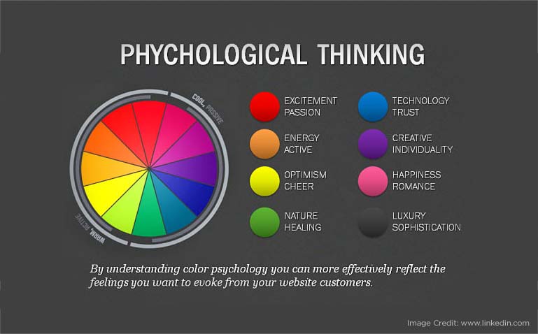
Choosing the right color combination is crucial if you want to design to increase conversions. Have you ever wondered why Facebook uses blue as its base color? Why food chains use a combination of red and yellow for their websites? This is because color has an immense impact on human behavior. Each color evokes a specific emotion, so you can control how your audience behaves when they visit your website.Choose the base color carefully and then choose a contrasting color for the other elements such as the navigation bar, CTA, buttons, and others.
A good web designer would be able to help you achieve your goals by using design principles to increase conversions. By implementing the above web design principles you can build a website which is not only appealing but helps you increase conversions and sign-ups.


You can connect with Mohammad Mohsin on LinkedIn