-
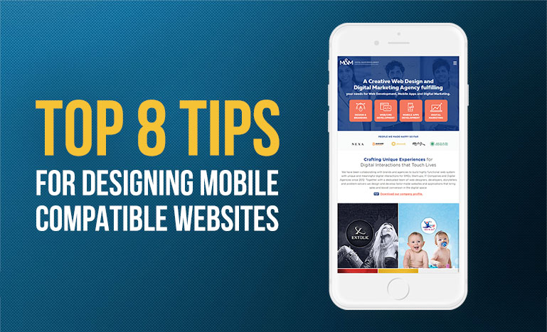
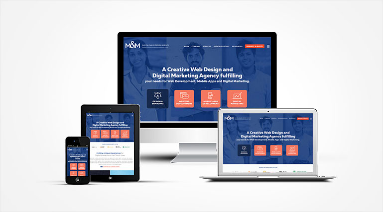
With increasing number of smartphone users, it has become crucial for businesses to engage their audiences on smartphones and other hand-held devices. This is the reason why you need to make your site mobile ready. Many web designers take the ‘Mobile First’ approach to create a website compatible with all devices, but there is a lot more you can do to make the websites even more appealing and impactful. Here are top 8 mobile web design tips and best practices to optimise your website for your mobile users.
Simple Yet Appealing
Remember browsing a website on mobile is different from browsing a site on desktop/laptop. Therefore, while designing a mobile compatible website you need to keep things simple and make sure you offer everything that a user might be looking for. -
Limit Content
Find out ways to tell the story in just a few words. More content will make the mobile website look cluttered; so keep the text part of the content short but effective when you design mobile-friendly websites. -
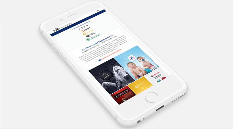
Images for Mobile Website Design

Images are a must when designing a mobile website. Hence make sure for mobile website design the images are well optimised and flexible. Images that are too heavy will make the website slower to load in browsers thus frustrating the mobile users. -
Keep the Navigation Simple
To improve the mobile user experience is important to design the navigation in a way that users are able to navigate through the entire website with one hand only. Make sure the buttons and navigation menus are large enough. This is especially true for buttons with CTA (call-to-action).
-
Use Video Wisely

Videos are the great way to convey a message, but when it comes to a mobile website make sure you use them wisely. Use a video player that is lightweight to ensure improved page loading time. -
Design Forms for Mobile
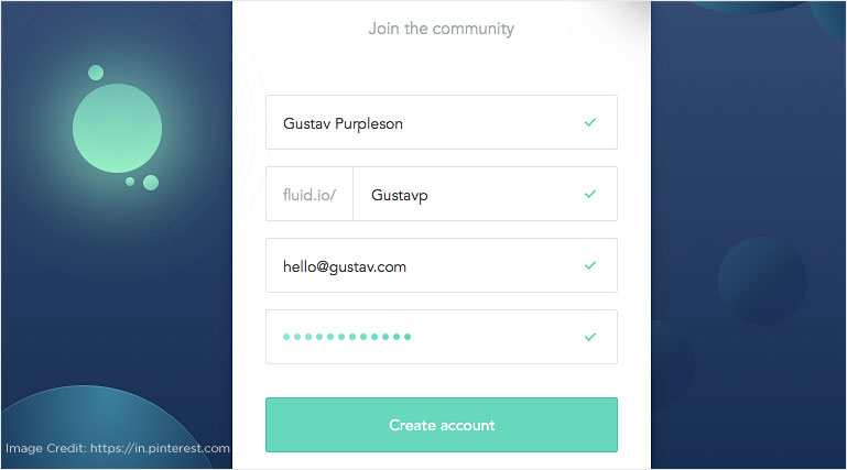
Keep the forms as short as possible. Since the screen sizes are considerably small, it is very tough to enter too many information at a time. Consider asking for information that is absolutely important. -
Use geo-location
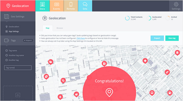
Smartphones offer numerous features that can be used to your advantage. For instance, you can use the Geo-Location feature to help users locate stores/restaurants or give directions. -
Build for the Future
Technology advances very quickly; faster than you can imagine. So you must build a website keeping the future in mind. Things will be completely different two years from now. Hence, assess the kind of changes that might rule the future and keep room for future modifications.
- Mobile presence is inevitable, but in order to win the race, you need to think-out-of-the-box. The above mobile website design tips will help you design a mobile website that is future ready and in sync with the needs of the users. Keep these tips in mind when designing your mobile website and stay ahead of the curve.


You can connect with Mohammad Mohsin on LinkedIn


