-
Web typography is an inevitable and crucial part of creating stunning designs — and typography isn’t just about orchestrating textual styles, there is significantly more to it. However, it’s common to come across blunders that many designers make when it comes to typography. Here are some of those you might want to avoid.
Tracking
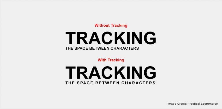
Simply put, tracking is the space between the letters of a word. Greater tracking means more space alongside words in a particular line. Designers make efficient utilization of tracking to fit words or phrases flawlessly along a specific line. Nevertheless, too much tracking can spoil the readability and legibility of the piece. -
Auto Hyphens
Many designers use auto-hyphenation to avoid the column lines from becoming ragged. However, in auto-hyphenation most of the lines in narrow columns automatically attach hyphens, making things torturous for readers. -
Base Alignment
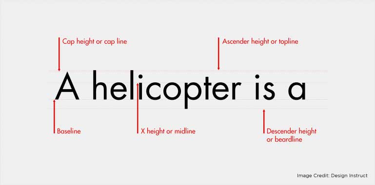
Maintaining a consistent baseline is a great idea while aligning text vertically. It maximizes readability even when the copy is in a different size or typeface. -
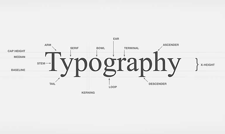
Headline Kerning
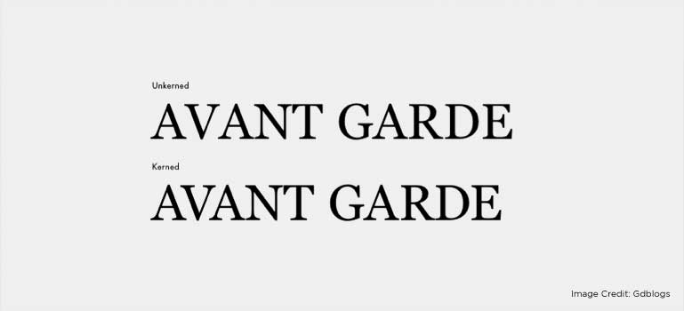
Often confused with tracking, kerning is increasing or decreasing the space between letters. Graphic designers should carefully kern titles in order to eliminate awkward spacing. -
Indentation
A visually appealing copy shouldn’t wrap under the number or bullet, irrespective of whether it’s a numbered or bulleted list.
-
Leading
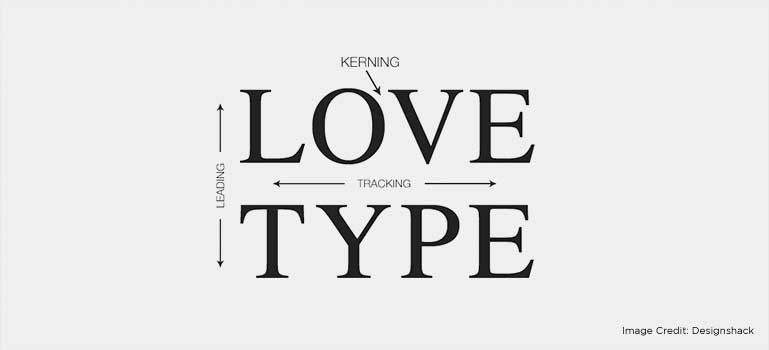
Leading increases readability. An ideal guideline will be 14 pt. for the text size and 17.5 pt. for the leading — roughly 25 percent greater than the text size. -
Orphans & Widows
If a paragraph ends with a line with just one word, it is termed as a widow. When a widow starts the next column, it is referred to as an orphan. Try not to create widows and orphans to ensure better readability.
-
Ragged Edged
Good typography needs time. Don’t just paste the copy into a column without caring for the line breaks or how ragged the copy is. A little effort to manually add soft breaks can greatly enhance the overall appearance of the design.
-
Justified Alignment
‘Justify’ was a rage in 60’s and 70’s, used to make column structures look orderly. But that was during the prime time of print media. In short, don’t use it in digital era unless required otherwise.
Many graphic designers prioritize visual effects in a design and set aside the typography part. This breaks the harmony and balance in the design. Typography should be planned in the early stages of the design process. This will improve the quality of the final content immensely.Hope this list will help you keep web typography mistakes at bay.


You can connect with Mohammad Mohsin on LinkedIn